Interlude.Input.DatePicker
In Depth
Input.DatePicker(label, defaultValue: null, includeTime: false, minimum: null, maximum: null, key: "", tooltip: "", helpText: "")
A calendar field, optionally with a time of day.
The answer is a DateTime — or null, when the field is left empty. This is the one input whose answer can genuinely be nothing, so either attach Behavior.Required or handle the empty case downstream. Result.GetDate takes a fallback for exactly this.
The field is shown and typed in the machine's own date format, so a user in one region and a user in another see what each expects. Only the display is regional; the value that comes back is a proper date, not the text of one.
To make one date depend on another — an end after a start — use Rule.CompareTo with Behavior.WithValidation.
The inputs are:
label(string) — Caption shown beside the field.defaultValue(object, defaults tonull) — Date the field starts on.includeTime(boolean, defaults tofalse) — Add a time-of-day box beside the calendar.minimum(object, defaults tonull) — Earliest selectable date.maximum(object, defaults tonull) — Latest selectable date.key(string, defaults to"") — Name of this answer in the results. Derived from the label when empty.tooltip(string, defaults to"") — Hover text.helpText(string, defaults to"") — A line of guidance shown under the field.
Returns element — The form element.
Search terms: date, calendar, time, when, datetime.
About the Input nodes
The fields a user answers.
Every input returns an element describing the control, not the control itself, and every one takes the same three trailing options: key, which names the answer in the results dictionary; tooltip; and helpText. Leave key empty and it is derived from the label — convenient for a quick form, but give real keys to any graph you intend to keep, because renaming a label would otherwise rename the answer.
Choice inputs take the values themselves, not their display names. Selecting an option hands back the original object — a Revit element, a family type, whatever was put in — so the answer is usable directly instead of needing a lookup back from a string.
Example File
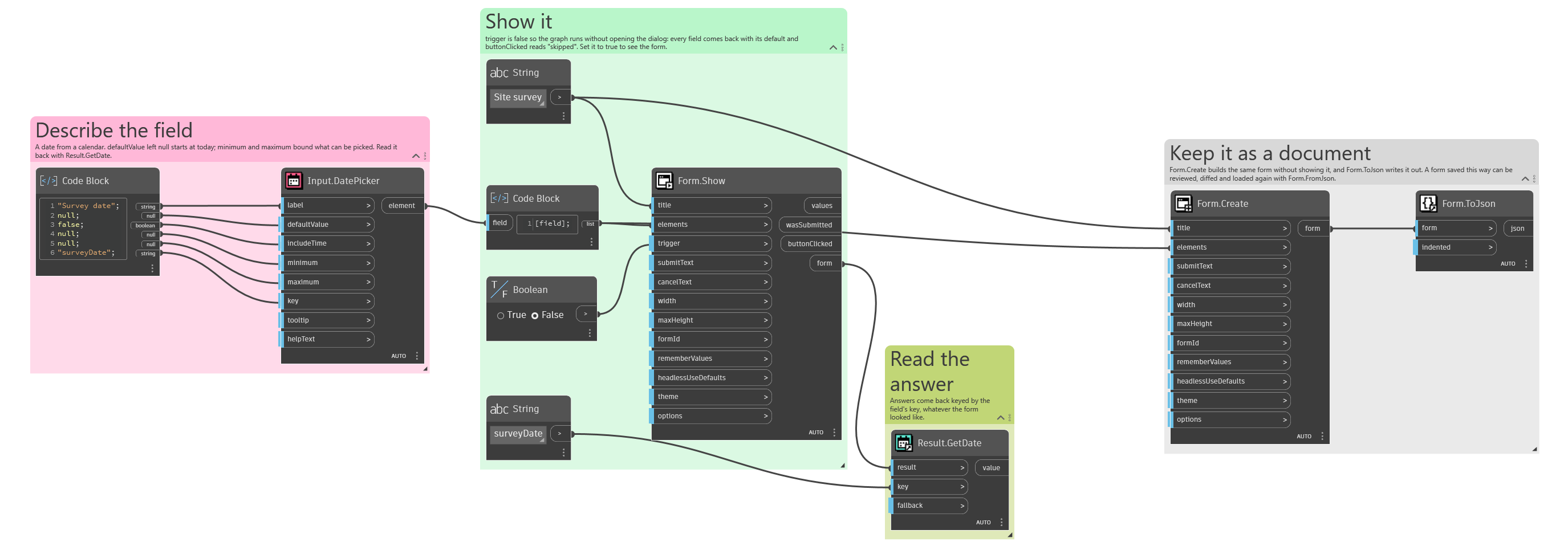
An example graph ships beside this page: Interlude.Input.DatePicker.dyn
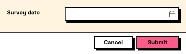
The form it builds: