Interlude.Input.ListBox
In Depth
Input.ListBox(label, items: null, displayNames: null, allowMultiple: true, defaultValue: null, visibleRows: 6, key: "", tooltip: "", helpText: "")
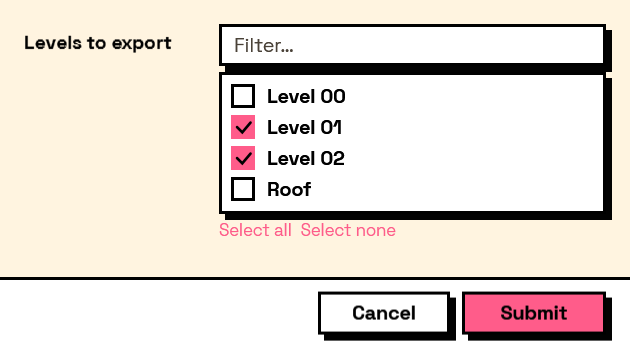
A list box showing several options at once, with a filter above it.
The shape of the answer depends on allowMultiple, and this is the thing to get right before wiring anything downstream. With it true — the default — the answer is a list of chosen items, empty when nothing is picked. With it false the answer is a single item. Read the multiple case with Result.GetList.
As with every choice input, what comes back is the object that went in, not its display name.
Prefer this to Input.DropDown when the user needs to see the options without opening anything, when they may need more than one, or when there are enough of them that the filter box earns its place.
The inputs are:
label(string) — Caption shown beside the field.items(list of object, defaults tonull) — The values to choose between. Can be any objects.displayNames(list of object, defaults tonull) — What to show for each item. Falls back to each item's own text.allowMultiple(boolean, defaults totrue) — Whether several items can be chosen at once.defaultValue(list of object, defaults tonull) — Which item or items start selected.visibleRows(integer, defaults to6) — How many rows are shown before the list scrolls.key(string, defaults to"") — Name of this answer in the results. Derived from the label when empty.tooltip(string, defaults to"") — Hover text.helpText(string, defaults to"") — A line of guidance shown under the field.
Returns element — The form element.
Search terms: listbox, list, multiselect, select, choose.
About the Input nodes
The fields a user answers.
Every input returns an element describing the control, not the control itself, and every one takes the same three trailing options: key, which names the answer in the results dictionary; tooltip; and helpText. Leave key empty and it is derived from the label — convenient for a quick form, but give real keys to any graph you intend to keep, because renaming a label would otherwise rename the answer.
Choice inputs take the values themselves, not their display names. Selecting an option hands back the original object — a Revit element, a family type, whatever was put in — so the answer is usable directly instead of needing a lookup back from a string.
Example File
An example graph ships beside this page: Interlude.Input.ListBox.dyn
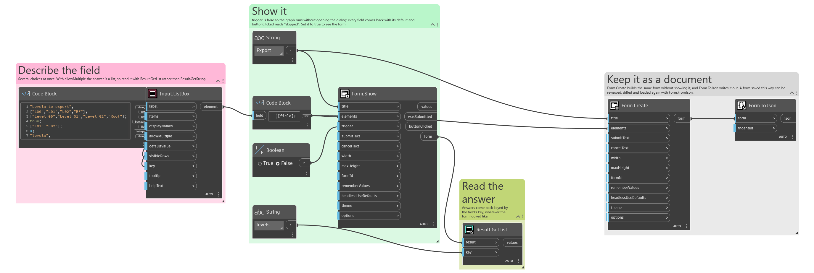
The form it builds: