Interlude.Theme.Create
In Depth
Theme.Create(mode: "Auto", accent: "", density: "Comfortable", cornerRadius: 4, fontSize: 13, fontFamily: "", labelWidth: 130, reducedMotion: false, shape: "Rounded", uppercaseHeaders: false, headerTracking: 0, borderWidth: 1, shadowOffset: 0, heavyText: false)
A theme built from scratch, with every knob exposed.
The presets are combinations of these ports; when one of them is nearly right, this is how you get the rest of the way. Note that it starts from the conventional look — hairline outlines, rounded corners, no shadows — not from the neubrutalist default, so a theme built here is quiet unless you ask for otherwise.
The ports worth understanding:
shape is Rounded, Pill or Square, and Pill ignores cornerRadius — it derives the radius from the control height instead, because "fully rounded" depends on how tall a control is. borderWidth and shadowOffset are what the neubrutalist look is built from; the shadow is solid and unblurred, and zero switches it off. labelWidth: 0 stacks labels above their fields, which is the better shape for a narrow form or long captions. uppercaseHeaders and headerTracking apply to headings only, never to body text, where letter spacing costs more in readability than it returns.
Leave fontFamily empty to keep Interlude's own embedded font, which renders the same on every machine. A font named here but not installed falls back to whatever the host has.
The inputs are:
mode(string, defaults to"Auto") — Auto, Light or Dark. Auto follows the Windows setting.accent(string, defaults to"") — Accent colour as hex. Empty keeps the palette's own accent.density(string, defaults to"Comfortable") — Compact, Comfortable or Spacious.cornerRadius(number, defaults to4) — How rounded controls are, in pixels.fontSize(number, defaults to13) — Base text size, in pixels.fontFamily(string, defaults to"") — Font name. Empty uses the host's interface font.labelWidth(number, defaults to130) — Width of the label column. Zero stacks labels above their fields.reducedMotion(boolean, defaults tofalse) — Switch off transitions.shape(string, defaults to"Rounded") — Rounded, Pill or Square. Pill ignores cornerRadius and uses the control height.uppercaseHeaders(boolean, defaults tofalse) — Render section and card headings as capitals.headerTracking(number, defaults to0) — Space between the letters of a heading, as a fraction of the font size.borderWidth(number, defaults to1) — How thick control outlines are, in pixels.shadowOffset(number, defaults to0) — How far a solid, unblurred shadow sits below and right of each control, in pixels. Zero is no shadow.heavyText(boolean, defaults tofalse) — Set labels, headings and buttons in a heavier weight.
Returns theme — The theme.
Search terms: theme, custom, style, brand, accent, font, density, pill, shape, border, shadow.
About the Theme nodes
How a form looks. Feed the result into Form.Show's theme port.
A theme is applied to the form's own window and nowhere else. Interlude runs inside Revit and inside Dynamo, and restyling a host application from a package would be an unwelcome surprise no matter how good the styling was.
Example File
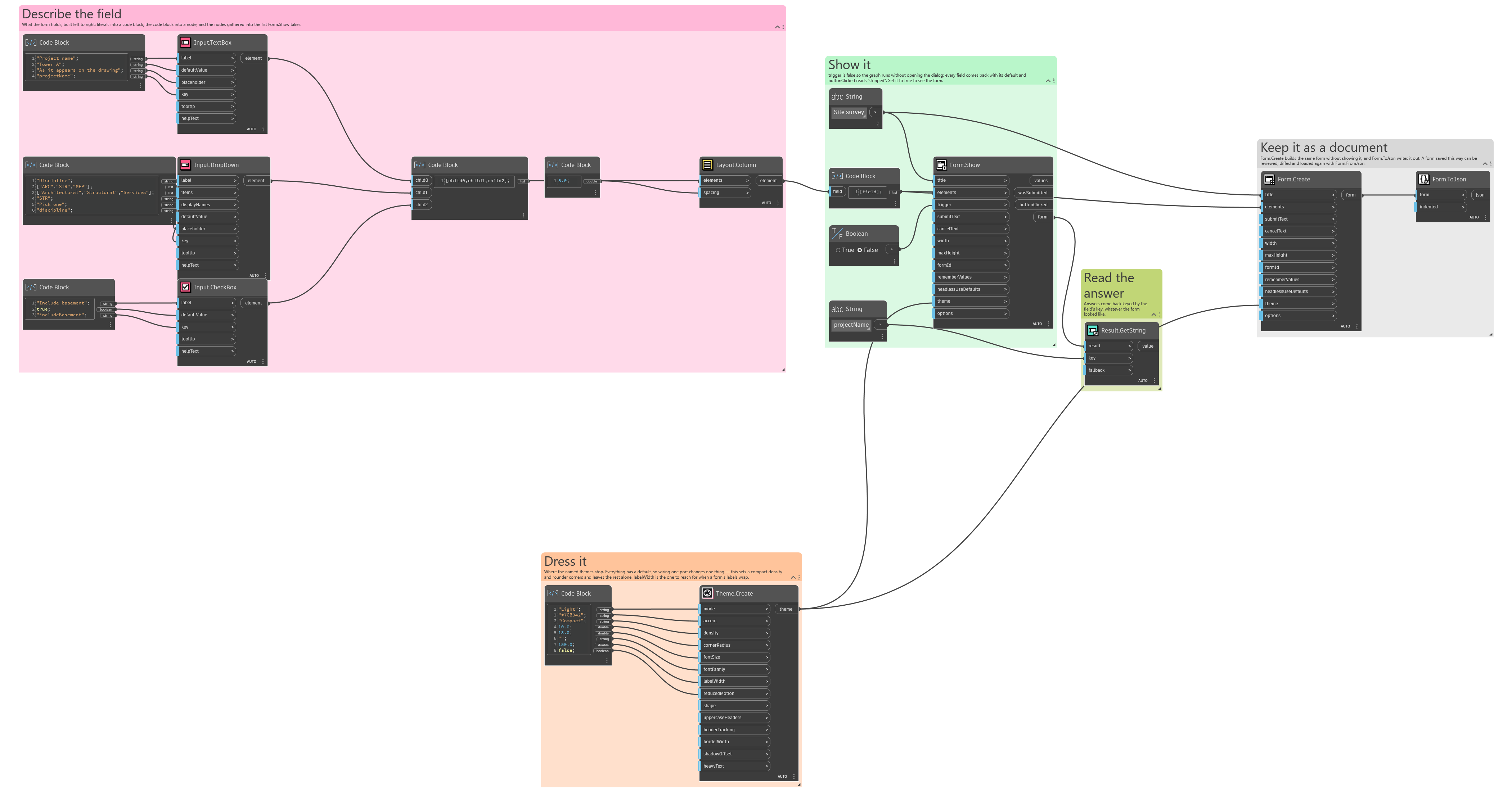
An example graph ships beside this page: Interlude.Theme.Create.dyn
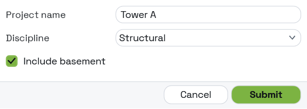
The form it builds: