Interlude.Layout.Card
In Depth
Layout.Card(elements, header: "", subheader: "", shadow: true)
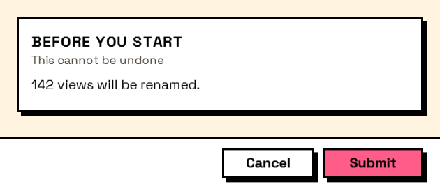
A raised panel with an optional heading and subheading, for something that deserves emphasis.
Where Layout.Section divides a form into parts, a card lifts one part out of it — a summary of what is about to happen, a warning, the totals at the end of a takeoff. Used once or twice in a form it draws the eye; used for every group it stops meaning anything.
hasShadow lifts it further. In a theme that offsets shadows the shadow is hard and flat; in one that does not it is soft and blurred.
The inputs are:
elements(list of FormElement) — What goes inside.header(string, defaults to"") — Optional heading.subheader(string, defaults to"") — Optional second line under the heading.shadow(boolean, defaults totrue) — Draw a drop shadow.
Returns element — The form element.
Search terms: card, panel, tile, surface.
About the Layout nodes
Arranging and decorating a form: sections, rows, grids, tabs, and the elements that show something rather than ask something.
Every container takes a list of elements. None of them has a single-element overload, on purpose: with both available, a graph that passes one element to a list port gets replication instead of a container, and produces N containers of one child each rather than one container of N. Pass a list, even a list of one.
Example File
An example graph ships beside this page: Interlude.Layout.Card.dyn

The form it builds: